“cPU” - Interactive projection, MaxMSP
20 Oct, 2010
“cpU” was my first project for the Victoria University of Wellington second year (media) design course “Experience Design” (MDDN221). My original concept was miles away from where I ended up, except for the multi-point tracking system I vowed to implement. I focused on building an accurate multi-point tracking system for the most of the project, and moulded my concept and visuals around my technical feats in the last few days before hand-in.
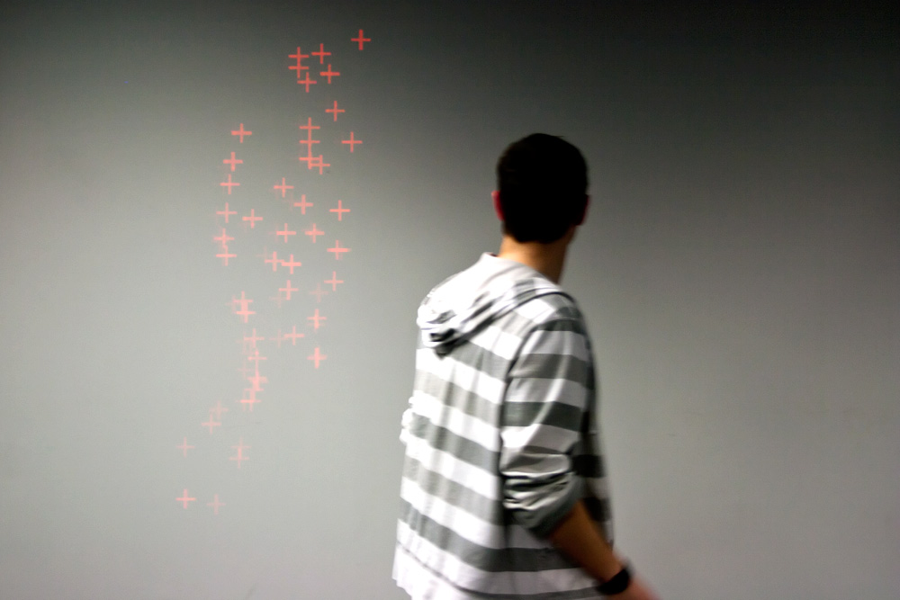
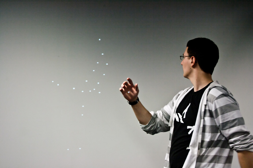
Here, the program was configured to analyse the input image at the highest resolution the (crappy) computer could handle without lagging.
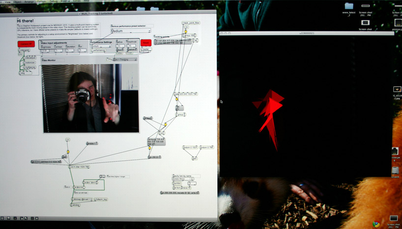
This was the final state of my application. It’s well organised at this point, so most of the objects in the screenshot contain heaps of other programming.
Brief and beginnings
The premise for this project was “Visual Music”. We were required to individually concept, design, program and present an interactive experience with the primary interface of a camera. The first few weeks of the course prior to project one were spent learning the basics of Max/MSP 5 and Jitter; a visual programming language where components are connected with wires (and the norms of written programming languages are somewhat thrown out the window). The course description of the project was:
During project 1, students will learn about interactive installations, and how to use camera vision in order to create generative visuals. Research into “Visual Music” and “Synaesthesia” will form the basis for the exploration of interactive visual systems. The task is to explore the various options of extracting data from the registered motion and to create a visual response that is strategized in space. The emphasis should lie on the appropriate combination of colour, form and rhythm. – [from mediazone.co.nz]
Initial concept
My initial idea was to have a ‘flow’ of ‘information’ that could be manipulated by multiple users. With no interaction the information flow, consisting of either binary or alphanumeric gibberish, would be an incomprehensible blur at ‘computer speed’. Upon user input, the flow of information would rapidly decelerate to a state of (relative) ‘slow-motion’ local to where interaction was detected, and the jumbled information would reassemble to reveal randomly grabbed words and dates.
I have chosen the keyword “information” as a driving force for creating my project. My aim is to create a ‘stream’ or torrent of information (perhaps numbers or binary) that slows when a user is present to allow for interaction, but is otherwise ‘real-time’ (on a computer scale). Complex information will be objectified through rhythm and structure, in such a way that the senses are filled, but not overloaded. The premise of this investigation is the idea that information can be beautiful, but things made for beauty rarely contain information. A non-active user will experience information at a computers pace, while an active user will ‘step into the computer world’ and be able to interact with information at their own speed; a reality slowed down to believability.
Project development
Though the description above sounds very tasty, I quickly steered away from my initial concept as it needed more development; I was unsure about the feasibility of creating it in Max/MSP/Jitter, and it more importantly, it didn’t fit with the brief. With the minor issue of no longer having a concept, I skipped designing my final outcome, and went straight to the technical side – developing a multi-point tracking system. For me, this technical challenge was much more exciting than rethinking and rewriting my concept to fit within the scope of the brief.
It only took me an hour or two to put together the basics of a multi-point tracking system from mostly components of the Computer Vision for Jitter library by Jean Marc Pelletier. Since the library component I used was designed for input with a DIY multi-touch pad, I spent most of the remaining project time tweaking the program to provide reliable, faster, more accurate tracking with a useful output.
Technical do-dads
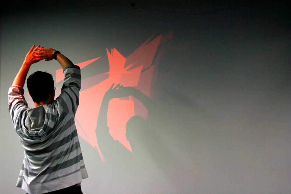
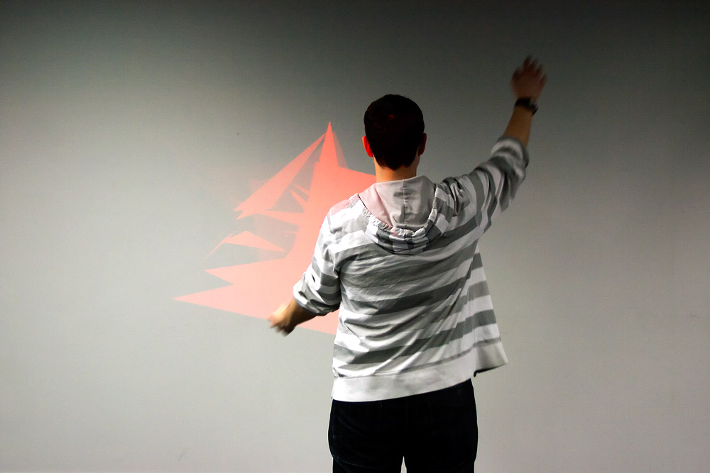
The raw camera image is adjusted for brightness and contrast by user defined settings to allow for variance in situation lighting. The processed video signal is then converted to greyscale and passed through two frame subtractors (comparing the current frame to the previous frame) to isolate and sustain movement. The greyscale isolation of movement is analysed for as many bright spots as allowed by a performance setting (the closest distance detected points can be together), and the resulting coordinates ‘spat’ out as they are detected. The visual element is generated by groups of six values (three x,y points) being grouped into polygons. These polygons are injected into frames in the time between one frame rendering and the next. When there is no user input for two seconds, the program switches to generating random grey polygons.
Final result & explanation
Without too much effort, I managed to twist my original keyword of ‘information’ to reflect my visuals and the important relationship of user to computer (or user to tool) – hence the capital U in “cpU”. My final project description was this:
Imagine the most powerful computer in the universe, and then take away its user. What does it become?
This project attempts to visualise the importance of user input to computers by putting participants in full control of a visual media experience. “cpU” (where “U” stands for user) contrasts a reflection of user “life” against the bleakness of non-input. User “input” through movement is received by a camera and translated into rich, lively visuals through a calculated grouping of moving points into shapes. The colour of generated shapes is initially initially red to represent life, but is influenced by how much movement is detected through the camera.
Without user movement it becomes quickly apparent that the visual element of “cpU” depends on user input for its “life”. The shapes generated in a state of non-input are bland, disjointed, and dull (grey) – representing the uselessness of a computer without user input or instruction.
The importance of user input to a computer that “cpU” demonstrates is fitting for any tool: a hammer without a hand to wield it is as purposeful as a rock hundreds of kilometres below the earth’s crust.
Other thoughts
Despite my frustration with the visual programming way of Max, I was pleased with the outcome on both design and technical levels. I achieved what I aimed for technically, and because of this the visual elements fell into place nicely.
Though my original concept didn’t satisfy the brief, I think it could be a good challenge and I would like to create it at some point (though probably not using Max/MSP).
A big thanks to Anne Niemetz (lecturer for this course) for her support and general awesomeness.
This is a backdated post. The publish date reflects when the it would have been posted originally, however the actual publish date was later. This post was last modified 4 Sep, 2012.
