Stecman brand - My own logo graphic
1 Aug, 2010
![]()
What’s in a name?
The name “Stecman” wasn’t the result of a brainstorm, a scribbled thought, or in fact anything conscious: it was a complete accident. Some time around ’98 or 2000, me, my brothers and a few friends were playing a network game Quake 2 and had been using the game’s console with the name command to change our player names like:
name "KillFace 10,000"
After a while, I decided to change my player name back to what it had been initially, “stev”, but I hit the wrong key:
name stec
I didn’t notice this error until one of my brothers commented on it, and for a reason I’m not sure of, I kept it.
The “man” part of arrived when I signed up for a Gmail account on March 25, 2005. I suggested using “stec302” as my account name, since it had been my the name of my hotmail account (woop), however my brothers insisted that I didn’t use numbers; there was no need to since Gmail was only a year old and still in beta, so there were a lot of available usernames. Again, for no reason I can recall, I created the account with the name “stecman”.
The S-dot Logo
At the start of my first year at university in 2009, I undertook the task of painting my Toshiba A10 laptop bright orange. As I recall, I went to clean the nozzle of the spray can and was drawing an “S” for kicks, when my finger slipped on the button and I managed to make a gap followed by a dot. Genius. Up until the time of writing this, I had thought this mark had been lost – later in that year I had written a portofolio entry about this and said:
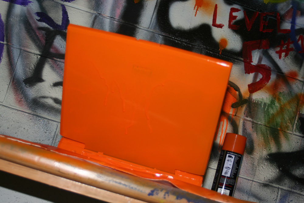
“Unfortunately when I went down to take a photo of the mark a week later, it had already been sprayed over with large fruit and strange characters.”
Turns out I was wrong – while looking for a particular photo in my library for another article, I scrolled past the laptop painting photos and thought I’d look closer to see if I had captured the mark by mistake. Bingo:

I had previously been using the unaltered text “stecman” with an orange theme for a logo, so I adjusted it slightly to create this (which, retrospectively is rather ugly!):
![]()
I used this logo (with the uninspired font choice of Calibri) until a university project in March 2010. The Identity and the Internet (DSDN206) project called for the creation of a personal brand including a logo and supporting documentation. Taking the opportunity to spend some solid hours working on something I would normally use to procrastinate with, I took the S-dot word mark I already had, and refined it.
You can download the full brand document if you like; it has as a few use examples and nice vector versions of everything. There’s also a video logo below that was part of this same effort.
![]()
Video Logo
If you can’t see the video in your browser (Firefox or IE<9), you’ll need to download the video file to watch (268KB).
Old video logo
Prior to the graphic update, I had created this video logo:
This is a backdated post. The publish date reflects when the it would have been posted originally, however the actual publish date was later. This post was last modified 2 Oct, 2012.